NEWS
Google Drive for Android Rolls Out Fresh Material 3 Design
Google is finally settling on a sleek new look for one of its most popular productivity apps. After a brief appearance and sudden disappearance earlier this year, a refined Material 3 visual update is rolling out again to Google Drive users on Android. This subtle yet significant refresh brings a cleaner, container-based interface that aligns the cloud storage app with the modern Android ecosystem.
A Polished Interface Returns
The most noticeable change in this update is the treatment of the main file list. Google has moved away from the edge-to-edge list design that users have known for years. Instead, the file list now sits inside a dedicated container.
This might sound like a minor technical detail, but it has a big impact on readability. The list now features slightly increased padding on the left and right sides. This creates a breathing room that separates your content from the app’s background.
The result is a floating effect that draws the eye directly to your files and folders.
By encapsulating the list, Google is following its own “Material 3 Expressive” design guidelines. This design language emphasizes grouping related content together to reduce visual clutter.
Here is what is different in the new layout:
- Containerized Lists: Files are no longer stuck to the edge of the screen.
- Rounded Corners: The file list container features soft, rounded corners at the top.
- Distinct Background: There is a clearer contrast between the navigation areas and the content area.
This layout mirrors recent changes seen in other Google Workspace apps like Gmail and Google Docs. It creates a sense of uniformity that has been missing from the Android experience for some time.
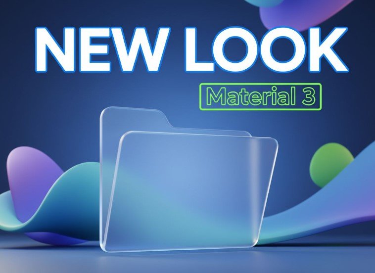
Google Drive Android app interface showing new material 3 container design
Why Google Is Changing the Look
You might wonder why Google keeps tweaking an interface that already works. The answer lies in consistency and usability.
Android has long suffered from design fragmentation. Even Google’s own apps sometimes look like they belong to different operating systems. This update is part of a broader effort to standardize the look of all first-party Google apps.
When every app follows the same rules for spacing, buttons, and navigation, users build muscle memory faster. You spend less time figuring out how to use the app and more time actually working.
The return of this design suggests that Google is now confident in this direction. The previous rollback likely happened because the design team needed to fix bugs or address negative feedback from early testers.
Journalist Note:
UI consistency reduces cognitive load. When your brain recognizes a pattern, like a floating file list, it instantly knows how to interact with it.
The “Material You” philosophy is also at play here. This design system adapts the color and shape of app elements to match your phone’s wallpaper and theme. The new container style provides a better canvas for these dynamic colors to shine without overwhelming the text.
Subtle Tweaks to Navigation
The visual refresh goes beyond just the file list. Google has also refined the bottom navigation bar.
The indicators that show which tab you are currently viewing—Home, Starred, Shared, or Files—have been slimmed down. Previously, these indicators were tall and pill-shaped. Now, they are shorter and less intrusive.
This reduction in visual weight helps the bottom bar feel less crowded.
The Floating Action Button (FAB), which is used to upload files or create new folders, remains a square with rounded corners. However, its coloring and shadow depth have been adjusted to match the new container hierarchy.
These small changes add up to a more polished experience. They respect the user’s need for screen real estate while keeping essential controls within thumb’s reach.
Understanding the Server-Side Rollout
If you rush to open your Google Drive app right now, you might not see these changes immediately. That is because Google is using a “server-side update” method.
Unlike a standard app update where you download a new version from the Play Store, server-side updates are triggered by Google remotely. They can switch the new design on for specific accounts or devices without you doing anything.
This method allows Google to monitor the performance of the new design in real-time.
If something breaks, they can switch it off instantly. This explains why the design appeared and vanished previously.
Here is how to check if you have the update:
- Open the Google Drive app on your Android phone.
- Look at the edges of your file list.
- If you see a gap between the list and the screen edge, you have the new design.
- If the list touches the edge, you are still on the old layout.
There is no way to force this update. Clearing your app cache or restarting your phone usually does not help. You simply have to wait for your account to be eligible.
A Unified Future for Workspace
This update signals that Google is getting serious about the “Material 3” transition. For a long time, Google Drive felt slightly outdated compared to the system interface of the latest Pixel or Samsung Galaxy phones.
With this refresh, Drive feels like a native part of the OS again. It is cleaner, faster to scan, and much more pleasing to look at.
We can expect similar “container” style updates to arrive on other Google apps soon. Google Keep and Google Tasks are likely next in line for this expressive treatment.
For now, Android users can enjoy a slightly more organized digital filing cabinet. It is not a revolution, but it is a welcome evolution.
The focus is clearly on making professional tools feel approachable and personal.
As we move further into 2024, seeing this design language stabilize across the ecosystem is a positive sign for Android maturity.

Orbio Closes $21M From Dawn Capital to Scale AI Frontline Agents

Honda’s Electric Trial Bike Lands in the Top Five at TrialGP Japan

GTA 6’s November Launch Is Reshaping the 2026 Game Calendar

Qorelo Lands $3.5M Seed to Tackle SAP’s 2027 Migration Crunch

Italian Edtech Sirius Game Raises €1.3M to Scale Primary School Play

Bestie Bite Raises €1.5M to Take AI Video Reviews to the US

European Tech’s €2.8B Week Came With a US Acquirer Twist
Rainn Wilson Calls Out Media’s Double Standard on Platner

OnePlus N6 Confirmed for June 30 India Launch as First N-Series Phone

Munich Court: Google Liable for False Answers in AI Overviews
Zcash Patched a Double-Spend Bug as ZEC Climbed 5%
Steam Summer Sale 2026 Locks In June 25 to July 9 Dates

Amazon Scraps Its Stargate Revival After a 20-Week Writers Room

Citigroup Says ETF Outflows Drove Bitcoin’s Crash, Not Strategy’s Sale

CLARITY Act Floor Vote Likely Shifts to August, Lummis Says

Coinbase Invests in Ethena, ENA Jumps 10% on Open-Market Buy

Gigaton Lands $26M to Replace Heavy Industry’s Control Stack

London AI Lab Inherent Raises $50m to Reinvent Science
Quobly’s €115M Bet to Scale Silicon Quantum Computing
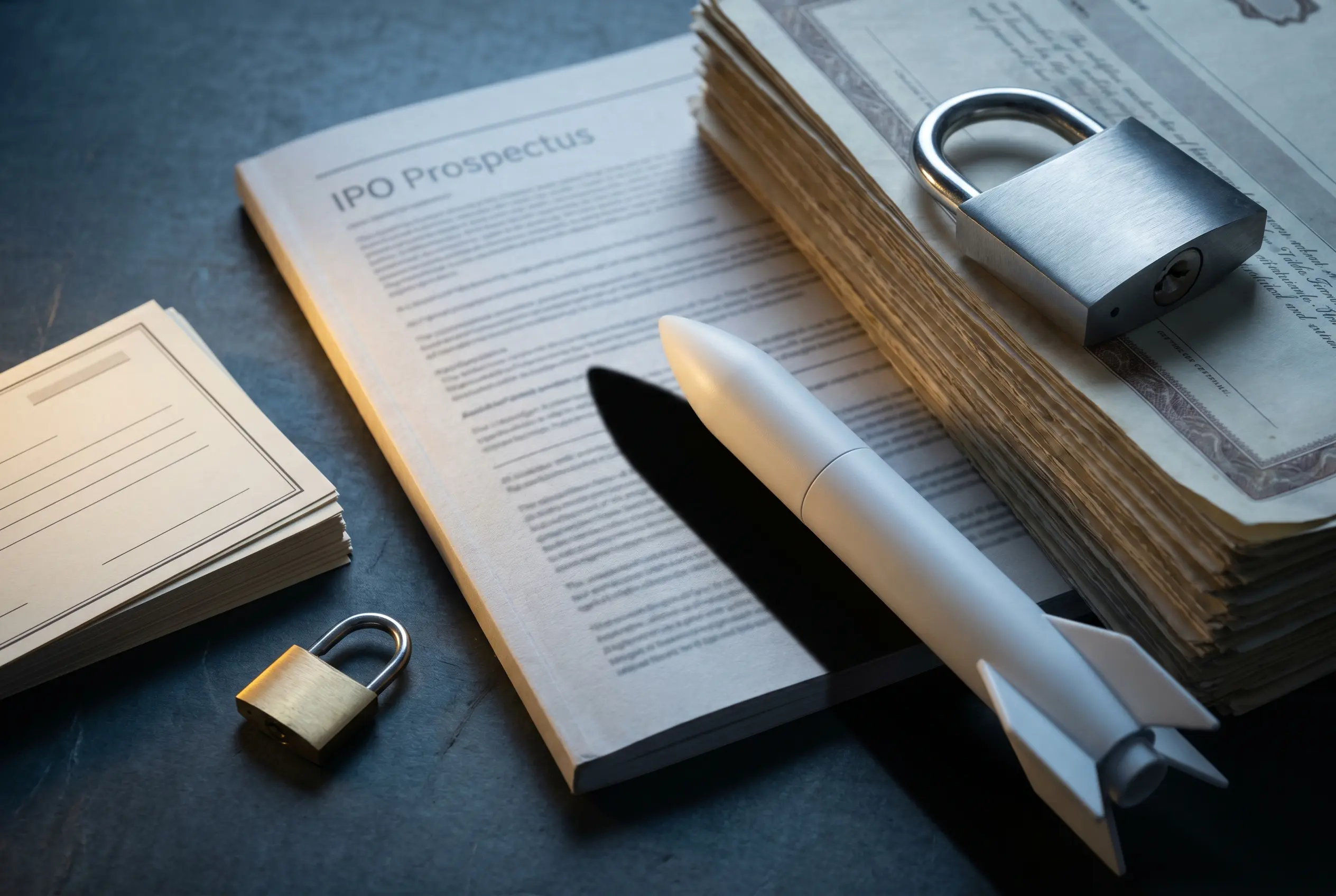
SpaceX Frees 5% of IPO Shares While Locking Musk for a Year
-
FINANCE2 weeks ago
Zcash Patched a Double-Spend Bug as ZEC Climbed 5%
-
ENTERTAINMENT2 weeks ago
Steam Summer Sale 2026 Locks In June 25 to July 9 Dates
-
 NEWS1 month ago
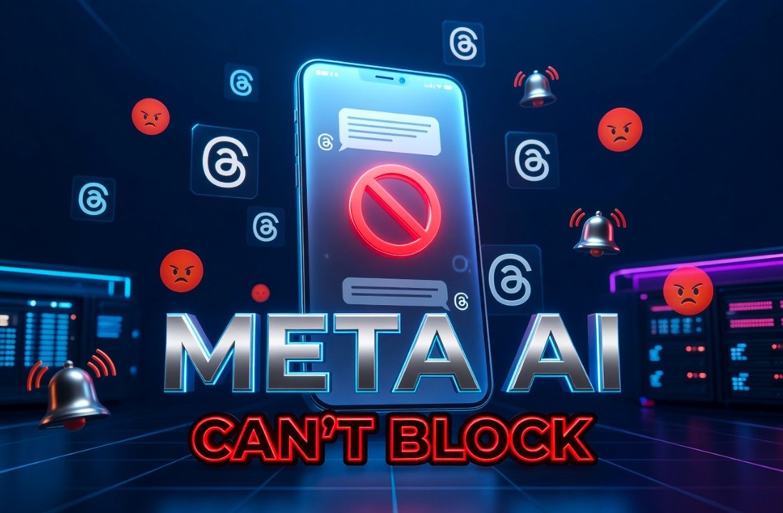
Meta Adds AI Replies to Threads, But Users Can’t Block It
-
 ENTERTAINMENT1 month ago
‘Widow’s Bay’ Review: Apple TV’s Sleeper Horror-Comedy Earns Its Fog
-
ENTERTAINMENT2 weeks ago
Amazon Scraps Its Stargate Revival After a 20-Week Writers Room
-
FINANCE2 weeks ago
Citigroup Says ETF Outflows Drove Bitcoin’s Crash, Not Strategy’s Sale
-
FINANCE2 weeks ago
Coinbase Invests in Ethena, ENA Jumps 10% on Open-Market Buy
-
FINANCE2 weeks ago
CLARITY Act Floor Vote Likely Shifts to August, Lummis Says