NEWS
Roku Rebuilds Its Home Screen to Feed a $4.15B Ad Engine
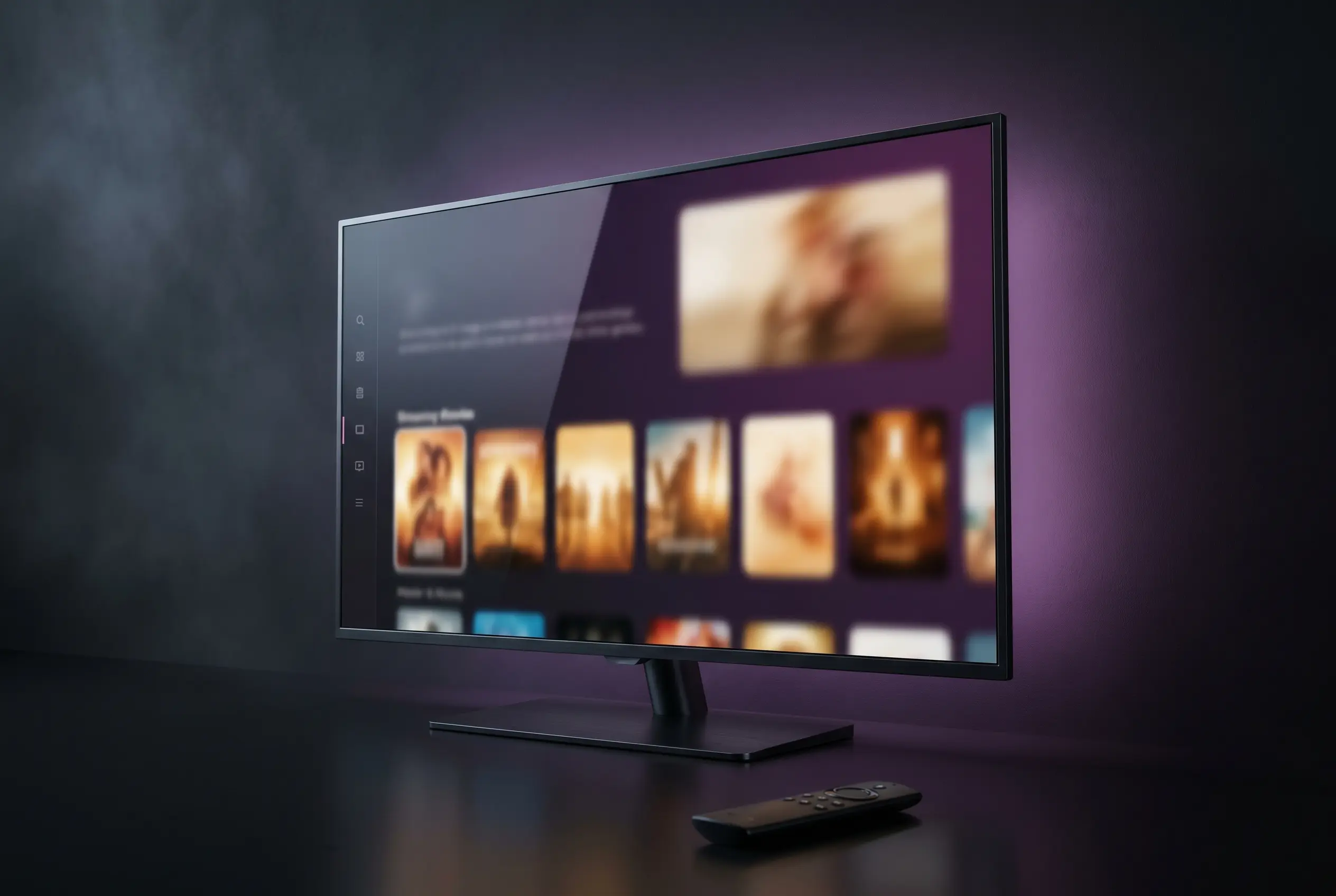
On Wednesday morning, Roku started pushing the first significant rebuild of its home screen in more than a decade to roughly 100 million streaming households, with no opt-out and no toggle to fall back to the old grid. The company is calling it a personalization upgrade. The accounting calls it something else: a refresh of the single screen that funnels traffic into a $4.15 billion platform business.
The May 27 rollout reaches every Roku TV and streaming player in the United States first, then expands to additional countries through the back half of the year. Anthony Wood, founder and chief executive of Roku, framed it as a response to viewer demand. The product, advertising and earnings math underneath it points somewhere else.
What Rolled Out on Wednesday
The new home screen replaces the tile-grid layout Roku has used since the early streaming-stick era. Content now sits in the center of the screen, with apps and navigation collapsed into a side rail that hides until called. The visual logic shifts from a launcher of services to a shelf of shows, films and live events drawn from across whatever the household already subscribes to.
Roku is shipping the redesign with a defined set of named modules, each with its own slot on the screen:
- Quick Access for the apps each profile opens most, reordered automatically as habits change.
- Top Picks for You, a recommendation row stitched together by Roku’s content-ranking models from billions of possible layouts.
- Destinations, genre and mood hubs such as For You and Subscriptions that surface titles across every linked service in one place.
- Your Daily Scoop, a rotating digest of breakout shows, viral moments and cultural trends.
- Roku City, the screensaver, promoted to a clickable tile that opens an interactive version of the cult-favorite skyline.
- Streamlined menu, collapsible navigation with elevated shortcuts to Save List, Continue Watching and search.
Search has also been pushed deeper into the experience, with results and prompts surfacing inside destinations rather than living only behind a magnifying-glass icon. The company says its intelligence layer chooses the best version of the home screen for each viewer in real time, with the layout shifting across the day depending on who is in front of the TV.
The $4.15 Billion Reason Behind the Redesign
Roku does not make most of its money from the boxes and TVs that carry its name. The platform segment, the layer that sells advertising and shares subscription revenue with streaming partners, generated $4.15 billion of Roku’s $4.74 billion total revenue last year. Devices contributed the rest, and barely at margin.
That weighting is why a home-screen overhaul is an earnings event dressed up as a UX (user experience, the design of how viewers move through software) story. The screen the redesign replaces is the single highest-traffic surface in connected-TV advertising, and the team rebuilding it has been explicit about treating it that way.
Where the Money Actually Sits
- $4.15 billion platform revenue last full year, up year over year on stronger advertising demand.
- 87.6% of total Roku revenue runs through that platform line, not hardware.
- 100 million streaming households on the platform as of April, a milestone the company crossed quietly in mid-April.
- $38 billion US connected-TV ad market projected for this year by eMarketer, growing close to 14% year over year.
Why a Layout Change Moves the Number
A grid of app tiles is a pass-through. A center-stage content shelf is inventory. Every row in the new layout is a position Roku can sell, sponsor, or fill with promotions for titles on The Roku Channel, where it keeps the entire ad load. Even the screensaver got upgraded to a clickable destination, which means a screen that used to display nothing but a cartoon city now has a click-through path the sales team can price.
Marquee Ads Take the Right Side
The most consequential change is one Roku barely highlighted in its consumer-facing announcement. The big marquee video advertisement that used to sit on the left of the home screen has been repositioned to the right side of the content shelf, where it remains visible while a viewer scrolls through recommendations rather than disappearing the moment they navigate away.
At Roku’s product event introducing the redesign, executives were direct about the logic.
The home screen is one of the most valuable pieces of real estate in streaming right now.
That line came from Preston Smalley, vice president of viewer product at Roku, in remarks reported by AdExchanger. Frances Callaghan, head of product commercialization, told the same room that Roku is using the same content personalization signals on the ad side so the marquee unit feels less like a banner and more like another recommendation. The non-endemic brands invited into the demo, including pet food maker The Farmer’s Dog, signaled how aggressively the company plans to court verticals beyond the studios it has historically relied on.
Roku’s pitch to the advertising market on Wednesday was that this is not more ads, but better ones. Whether that distinction survives contact with the home screen most viewers will actually see is the open question of the next two quarters.
How It Compares With Fire TV and Google TV
Roku is the last of the three large US smart-TV operating systems to perform this kind of overhaul. Amazon’s Fire TV redesign began rolling out in February, and Google TV’s reorganized home shipped in late 2025. The competing layouts have converged on a similar idea: a recommendation-first hero panel, fewer top-level tabs, and aggregated content across services. The differences sit in the details.
| Platform | Launch of Current Redesign | Layout Direction | Pinned Apps Cap | Opt-Out to Old UI |
|---|---|---|---|---|
| Roku | May 27, 2026 | Content shelf center, side-rail nav, marquee ad held to the right | Quick Access auto-curated | None confirmed |
| Amazon Fire TV | February 2026 | Top-bar tabs, hero recommendations, horizontal app row | Up to 20 | Limited, by device |
| Google TV | Late 2025 | Three tabs (Home, Live, Apps), recommendation-led, deeper personalization controls | Customizable rows | No |
The harder distinction is philosophical. Google has spent the last year giving viewers more granular dials on how aggressive its recommendations feel and where ads land. Amazon’s 2026 Fire TV interface overhaul raised the pinned-app cap from six to twenty, a clear concession to power users. Roku is moving in the other direction. Quick Access is automatic. There is no toggle back to the grid most loyal users have memorized after ten years. The screen each household sees is the screen Roku’s models decided they should see.
The User Revolt Already Brewing
Roku quietly tested the redesign with a small slice of accounts earlier this spring, and the reaction set the tone for what is coming. Reddit and forum threads filled with complaints that personally arranged app grids had been buried, that promoted content sat above user choices, and that the new layout felt heavier on advertising than the one it replaced. Cord Cutters News reported that Roku has confirmed the new home screen will not be optional once the full rollout reaches a given device.
The recurring criticisms cluster around the same handful of grievances:
- App tiles users had arranged themselves now sit below promoted content and require scrolling to reach.
- The Roku Channel and Live TV guide receive heavier placement, pushing third-party services down the screen.
- Sponsored content in the carousel appears before user-pinned destinations.
- Viewers report no setting to revert to the previous tile grid, even temporarily.
Roku’s bet is that the personalization machinery underneath the new layout, particularly Top Picks for You and the adaptive Quick Access row, makes the friction worthwhile within a session or two. Critics in the streaming-device community argue the opposite, that long-time users who configured their home screens by hand will treat any forced reflow as a downgrade regardless of what the algorithm surfaces next. The lack of a fallback is what gives the complaint volume teeth.
Coming to Europe in the Months Ahead
The redesign is US-first by design. Roku said the new home screen will roll out to additional countries in the coming months, without naming them, and without a specific date for the United Kingdom, Germany or France, the three European markets where it has the largest installed base of Roku TVs through partners such as Hisense, TCL and Sharp. Roku’s European footprint is smaller than its North American one, which is part of why the company is choosing to debug the model on its home market first.
For European viewers, the practical questions are different. The continent’s streaming bundle looks nothing like the US version, with public-service broadcasters such as the BBC, ZDF and France Televisions holding a larger share of viewing time than they do across the Atlantic. How the Top Picks row treats free, ad-light public broadcasters next to subscription services such as Netflix and Disney+ will determine whether the redesign translates cleanly, or whether Roku has to rebuild parts of it for each market it enters. For more context on Roku’s recent product moves, see our earlier coverage of the Live TV Guide search update that preceded this overhaul.
If the redesign holds engagement through the first full earnings update after the international launch, the platform revenue line that already carries the company will become harder to grow without leaning even further into the advertising surface this screen now provides. If it loses scrolling time to user fatigue or churn, the most valuable piece of real estate in streaming will need another rebuild long before another decade has passed.

Orbio Closes $21M From Dawn Capital to Scale AI Frontline Agents

Honda’s Electric Trial Bike Lands in the Top Five at TrialGP Japan

GTA 6’s November Launch Is Reshaping the 2026 Game Calendar

Qorelo Lands $3.5M Seed to Tackle SAP’s 2027 Migration Crunch

Italian Edtech Sirius Game Raises €1.3M to Scale Primary School Play

Bestie Bite Raises €1.5M to Take AI Video Reviews to the US

European Tech’s €2.8B Week Came With a US Acquirer Twist
Rainn Wilson Calls Out Media’s Double Standard on Platner

OnePlus N6 Confirmed for June 30 India Launch as First N-Series Phone

Munich Court: Google Liable for False Answers in AI Overviews

Zcash Patched a Double-Spend Bug as ZEC Climbed 5%

Steam Summer Sale 2026 Locks In June 25 to July 9 Dates

‘Widow’s Bay’ Review: Apple TV’s Sleeper Horror-Comedy Earns Its Fog

Amazon Scraps Its Stargate Revival After a 20-Week Writers Room

Citigroup Says ETF Outflows Drove Bitcoin’s Crash, Not Strategy’s Sale

Coinbase Invests in Ethena, ENA Jumps 10% on Open-Market Buy

CLARITY Act Floor Vote Likely Shifts to August, Lummis Says

Gigaton Lands $26M to Replace Heavy Industry’s Control Stack

London AI Lab Inherent Raises $50m to Reinvent Science

Quobly’s €115M Bet to Scale Silicon Quantum Computing
-
FINANCE2 weeks ago
Zcash Patched a Double-Spend Bug as ZEC Climbed 5%
-
ENTERTAINMENT2 weeks ago
Steam Summer Sale 2026 Locks In June 25 to July 9 Dates
-
 NEWS1 month ago
Meta Adds AI Replies to Threads, But Users Can’t Block It
-
ENTERTAINMENT4 weeks ago
‘Widow’s Bay’ Review: Apple TV’s Sleeper Horror-Comedy Earns Its Fog
-
ENTERTAINMENT2 weeks ago
Amazon Scraps Its Stargate Revival After a 20-Week Writers Room
-
FINANCE2 weeks ago
Citigroup Says ETF Outflows Drove Bitcoin’s Crash, Not Strategy’s Sale
-
FINANCE2 weeks ago
Coinbase Invests in Ethena, ENA Jumps 10% on Open-Market Buy
-
FINANCE2 weeks ago
CLARITY Act Floor Vote Likely Shifts to August, Lummis Says